Book Spine Design Tips: How to Make Your Book Stand Out
Table of Contents:
1. Introduction
1.1 Designing A Spine That Catches The Eye
2. Understanding The Book Spine
2.1 What Is A Book Spine?
2.2 The Importance Of A Book Spine
2.3 The Function Of A Book Spine
2.4 What Can Be Included On A Book Spine
3. Types Of Book Spine Designs
4. Bad Book Spine Designs: What To Avoid
5. How Book Spines Are Manufactured
5.1 Perfect Binding
5.2 Basic Trimming Margins
5.3 What is Bleed?
5.4 Spine Width
5.5 Spine Position
5.6 Spine Text
6. How to Design an Amazing Book Spine
6.1 Selecting the Spine Background
6.1.1 Importance of Color Psychology
6.1.2 Coherence with Overall Design
6.1.3 Visibility Factor
6.2 Arranging the Spine Type
6.2.1 Font Selection
6.2.2 Spine Font Size and Scaling
6.2.3 Spine Text Positioning
6.2.4 Balancing Elements
6.3 Designing a Spine for a Book Series
6.3.1 Consistent Theme Across the Series
6.3.2 Series Numbering
6.3.3 Differentiating Each Book
6.3.4 Coherence with Front and Back Cover
6.4 Creating a Unique and Attractive Spine Design
6.4.1 Visual Appeal
6.4.1.1 Contrasting Colors
6.4.1.2 Distinctive Logos
6.4.1.3 Importance of Branding
6.4.1.4 Design Considerations
6.4.1.5 Case Studies
6.4.1.6 Decorative Elements and Unique Materials
6.4.2 Complexity and Simplicity
Sources:
1. Introduction
Book spine design is a critical element in the realm of publishing. It can significantly influence a book’s journey from the shelf into the reader’s hands. Unfortunately, it’s often overlooked, While a book cover might be the face of a story, the spine is its voice on the shelf, calling out to potential readers. We’ll explore the importance of book spine design in the competitive bookselling market. How its role is life-critical in drawing readers’ attention and highlighting your book’s distinct character.

Consider a stroll through a bookstore or a library. The first aspect that catches a reader’s eye on a book shelf, isn’t the front cover. It’s the book spines lining the shelves. These spines, standing shoulder to shoulder, hold the fate of the book in their slender dimensions. They are the factor that often influences a reader’s decision to extend their hand, pull a book from the shelf, and turn it over to read more. In this pivital moment, a well-designed spine can set a book apart from its neighbors, enticing readers with its allure.
1.1 Designing A Spine That Catches The Eye
Crafting a book spine that stands out is both an art and a strategic endeavor. This blog post unravels the nuances of designing a spine that catches the eye and encapsulates the essence of the book. From the interplay of colors and typography to the subtle use of imagery and texture, we will explore the tips and techniques that can transform your book’s spine into a magnet for readers’ attention. In short,
- How to make your book stand out
- How to attract and entice new readers
- How to showcase your book’s unique identity
Whether you are an author, a designer, or a publisher, understanding the intricacies of book spine design is crucial. It’s not just about making a book look attractive on the shelf. It’s about giving your book a voice in a crowded room. Even before turning its pages, it has a chance to tell its story.

2. Understanding The Book Spine
2.1 What Is A Book Spine?
Before diving into design tips, it’s essential to understand what a book spine is and the crucial role it plays. The book spine connects the front and back covers of the book. It’s the outside portion of a book that becomes visible when shelved. It’s not just a structural element. It’s the backbone of the book, both literally and figuratively.

2.2 The Importance Of A Book Spine
The book spine indeed plays a pivotal role in shaping a book’s identity. When placing a book on a shelf, as stated above, the spine becomes the most visible part, making it the first point of contact for potential readers. This visibility makes the spine a crucial element in a reader’s decision-making process when choosing a book.
A well-designed book spine can instantly grab a reader’s attention, piquing their curiosity and enticing them to pick up the book and learn more about its content. It can convey critical information about the book. Things the title, author’s name, and publisher, and more in a clear and concise manner. Moreover, the design, color, and typography used on the spine can give a glimpse into the book’s genre and tone, helping readers quickly identify if the book aligns with their interests.
A poorly designed book spine can easily blend into the sea of books on a shelf, reducing its likelihood of catching the attention of potential readers. It could also misrepresent the book’s content, leading to missed opportunities for reaching the right audience.
Therefore, investing time and effort into designing an appealing book spine can significantly enhance a book’s appeal and success. It can help your book to stand out in a crowded marketplace, attract the right readers, and ultimately increase the likelihood of your book being read. So, the impact of a well-designed book spine extends beyond aesthetics; it’s a strategic tool for marketing and selling your book.
2.3 The Function Of A Book Spine
The primary function of a book spine is to bind the pages together and ensure the book opens and closes without damaging the pages. This structural aspect of the spine is crucial. It holds the book together and provides the necessary hinge action that allows for easy reading. A well-crafted spine ensures that the book withstands repeated handling and the stresses of opening and closing over time, thus preserving the book’s integrity.

But the role of a book spine extends far beyond just practicality. It plays a vital part in the book’s overall durability and usability. A robust spine prevents pages from becoming loose or falling out, ensuring a long life for the book. Additionally, the spine can affect the book’s opening behavior – whether it lies flat when open, how wide it can open, and how comfortable it is to hold while reading.
Moreover, the spine of a book has an essential role in storage and retrieval. On bookshelves, where only the spines are usually visible, the spine becomes the book’s face in many situations. It’s the first point of contact for potential readers browsing through shelves. It’s the element of the book that conveys critical information swiftly and effectively.
As an author, you also need to consider the type of format you will publish your book in. Will you select a hardcover format of a paperback format? In truth, each format has its unique strengths and weaknesses. It is vital to understand both and make an informed decision. Click this link to visit our blog post titled “Hardcover VS Paperback: Which is the Better Choice?“.
2.4 What Can Be Included On A Book Spine
The spine of a book is more than just a structural element. It’s a mini billboard for the book, containing important information and helping to establish the book’s identity. Depending on the situation, ere are the essential elements that can be present on a book spine:
Title: The title is the most prominent text on the spine. Readers will see it first when your book lines up on a shelf with others.
Subtitle: If your book has a subtitle, it can also be included on the spine. However, due to space constraints, it may need to be abbreviated or omitted.
Image: Some books feature small images or icons on the spine that relate to the book’s content or theme.
Author‘s Name: The author’s name is another crucial element on the spine. This allows readers to find your book when browsing by author.
Publisher Identifier: This could be a logo, the publisher’s name, or both. It helps to establish the book’s provenance and can add an air of professionalism1.
ISBN Barcode: While not always included on the spine, some books feature the ISBN barcode here as well as on the back cover.
Book Design Elements: Colors, fonts, and graphics that are consistent with the book’s cover design can be extended to the spine. These elements help in creating a visual identity for the book and make it more recognizable on a shelf.
Volume Number: For books that are part of a series, the spine may include the volume number. This helps readers find the correct book in the sequence.
Remember, the spine of your book is prime real estate. It’s often the first thing potential readers see when your book is sitting on a shelf or book display stand. Each of the above elements plays a part in making your book easily identifiable and enticing to readers. A well-designed spine is a synergy of these components, harmoniously balanced to make your book stand out on any shelf it calls home. In addition, make sure to design it to grab attention and convey the essential information about your book.
3. Types Of Book Spine Designs
Various styles or types categorize book spine designs in the world of publishing. The exact number of distinct “kinds” is not fixed due to the creative and evolving nature of book design. Here are some common types of spine designs:
Text-Only Spines: These feature the title, author’s name, and sometimes the publisher logo or imprint. They are straightforward and common in academic or professional books.
Graphic Spines: These include graphic elements or artwork, often extending from the cover design. They are popular in fiction and children’s books.
Minimalist Spines: Featuring minimal design elements, often with a focus on typography and color.
Vintage or Classic Spines: These might feature ornate designs, traditional fonts, and embellishments reflective of historical design aesthetics.
Modern/Contemporary Spines: Utilizing contemporary design trends, often with bold typography, abstract graphics, and vibrant colors.
Series-Themed Spines: For book series, where each spine may contain a unique element but collectively form a cohesive design when placed side by side.
Photographic Spines: Using photographs as the primary design element.
Illustrated Spines: Featuring hand-drawn illustrations or artwork.
Textured or Embossed Spines: These have raised or textured elements that add a tactile dimension to the design.
Multicolored or Patterned Spines: Using multiple colors or patterns, often for visual impact on bookshelves.
Each of these design types serves a specific purpose and caters to a particular audience. The choice of spine design can significantly influence a book’s appeal and visibility on the shelf. Therefore, it’s crucial to consider these factors when designing a book spine.
4. Bad Book Spine Designs: What To Avoid
While designing a book spine, it’s crucial to avoid certain common mistakes that can detract from the book’s appeal. Here are some pitfalls to avoid:
Overloaded Space: Avoid overloading the spine with too much information or complex designs. A cluttered spine can be hard to read and may deter potential readers2.
Illegible Text: Ensure that the title and author’s name are legible and do not blend in with the background or decorations. The text should be clear and easy to read at a glance.
Incorrect Size: The spine size should be calculated correctly based on the page count, paper type, and cover material. An incorrectly sized spine can lead to design issues and may affect the book’s durability.
Poor Quality: Avoid poor quality or misaligned book spine designs. A well-designed, aligned spine not only looks professional but also ensures the book’s longevity.
Thin Spines with Text: For books ranging between 40 to 60 pages, the spine is often too thin to effectively accommodate text. In such cases, adding text to the spine is not advisable, as it becomes nearly impossible to read and can give the book a cluttered or unprofessional appearance3.
Remember, the best design for a book spine depends on the book’s genre, target audience, and the author’s personal style. It’s always a good idea to explore different designs and choose the one that best fits your book. Avoiding these common mistakes can help ensure that your book spine is both functional and aesthetically pleasing.
5. How Book Spines Are Manufactured
The manufacturing of book spines involves several steps and considerations. Here’s anoverview of the process:
5.1 Perfect Binding
This is the most common method of creating paperback book spines. It involves gluing the pages to the spine of the book cover. The result is a square, printable spine that can hold the book’s title, author’s name, and other information. The following video depicts a simplified version of this process on a hand-fed machine.
(Courtesy: https://youtu.be/n3Mk26PEnV0)
5.2 Basic Trimming Margins
To achieve uniformity, printers trim the pages and the cover of the book. In fact, this process ensures that all pages align perfectly with the book’s spine and cover. The standard measurements for book trimming margins are as follows:
- Side Book Margins: The minimum margins are 3/4″ on the spine side and 1/2″ on the outside4. This ensures that all pages align perfectly with the book’s spine and cover.
- Top/Bottom Book Margins: Allow 1/2″ top or bottom margin. This provides a balanced and aesthetically pleasing look to the page.
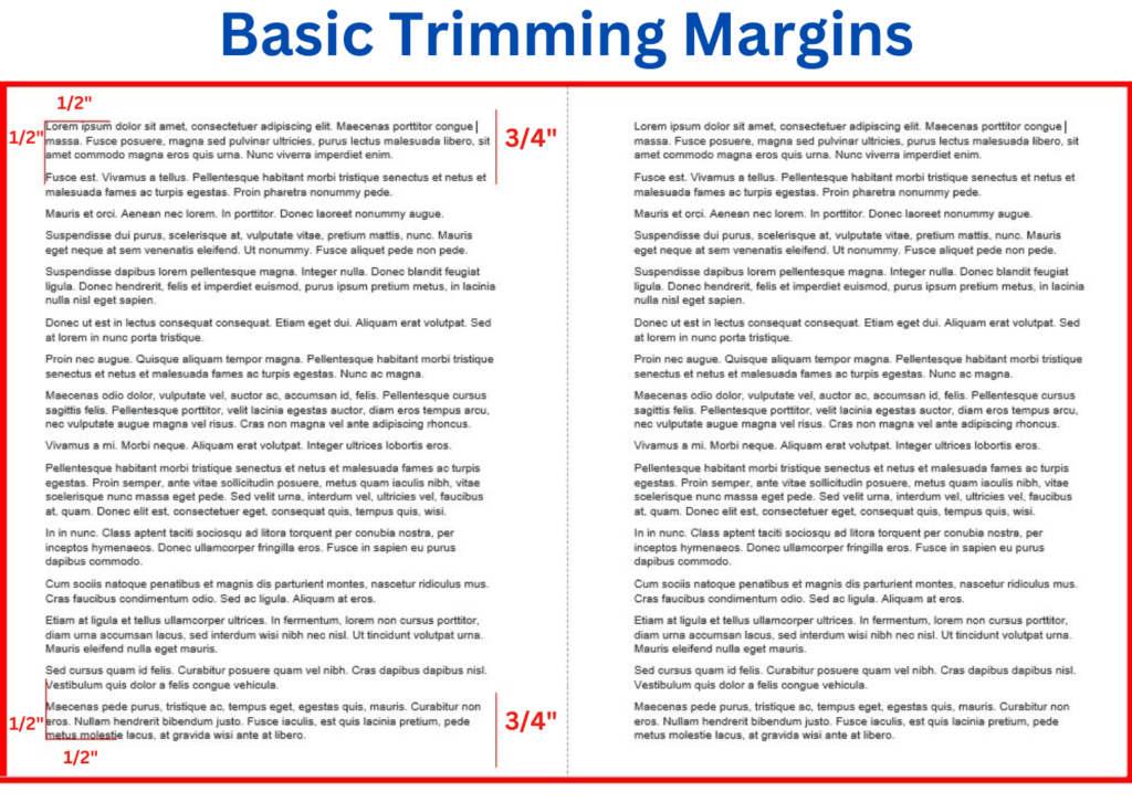
These measurements ensure that the trimming process does not cut off the text and that the book maintains a uniform appearance. Please note that these are standard measurements and may vary depending on the specific requirements of your book. Always check with your printer for their book margins specific guidelines.
5.3 What is Bleed?
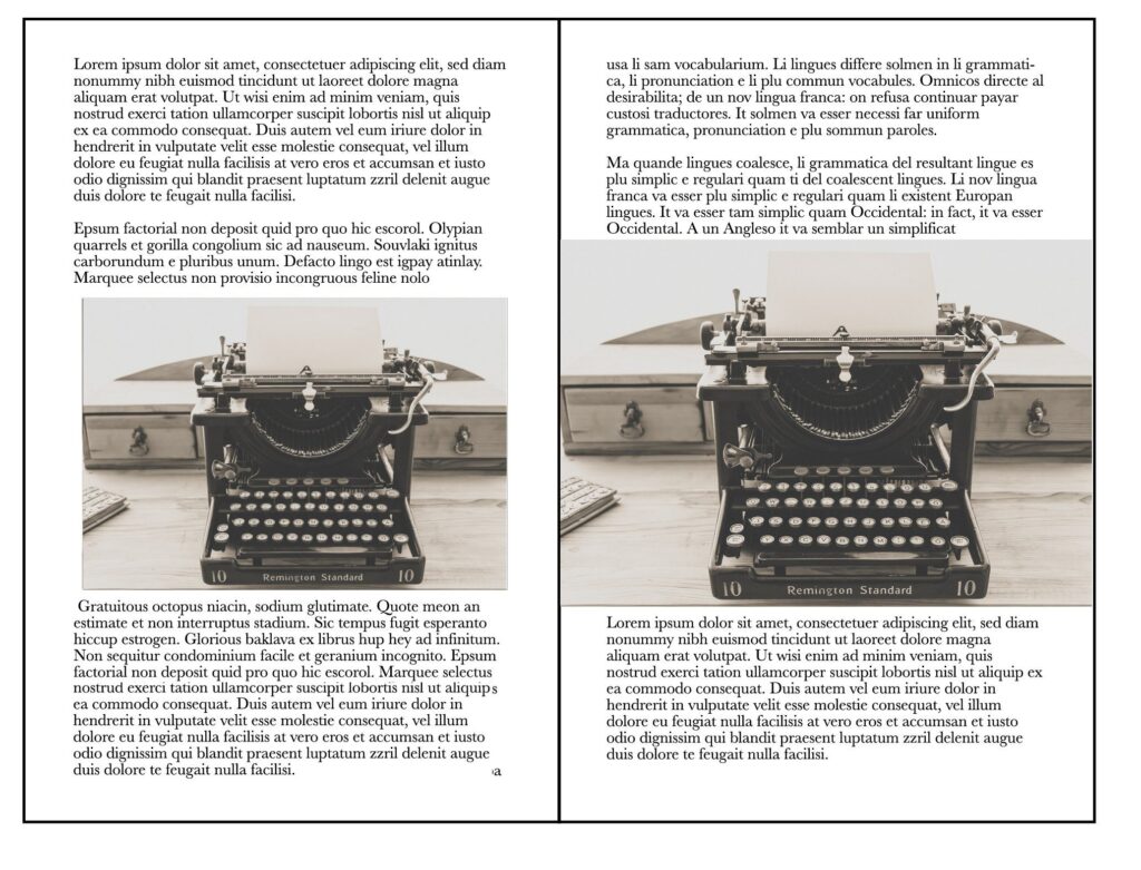
The concept of bleed refers to the area of your design or page that extends beyond the trim edge of the book. This margin of error prevents important content from being cut off during the trimming process. The following depicts the bleed on book pages. The same principle applies to the bleed for the exterior cover design.
5.4 Spine Width
The width of the spine is calculated based on the number of pages in the book and the thickness of the paper. Moreover, this measurement is crucial for the design and printing process, as it determines how much space you have for text and other elements on the spine. Click the link to access the excellent Book Spine Calculator and to see how it can help you determine the width of your book spine.
5.5 Spine Position
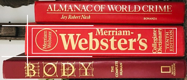
Due to potential variances in the printing process and trimming, the exact position of the spine can slightly vary5. This is why it’s important to allow for a certain margin around your spine text and design elements to ensure they don’t get cut off or end up too close to the edge.
5.6 Spine Text
The text on the spine should be sized and centered properly to ensure it’s easily readable. Also, it’s important to allow for a bleed margin to prevent the text from being cut off during the trimming process.
Remember, the manufacturing process of book spines requires careful planning and precision. By understanding these steps, you can ensure that your book spine is not only functional but also aesthetically pleasing.
6. How to Design an Amazing Book Spine
A book spine is more than just a sliver of space on your bookshelf; it’s a marketing tool. A well-designed spine can make all the difference in drawing a reader’s eye in a crowded bookstore. The spine of a book is often the first thing a potential reader sees, especially when books are lined up on shelves. It’s crucial that your book spine stands out, yet remains clear and legible. This involves a careful selection of fonts, colors, and images that represent the essence of your book’s content and genre.

It should be cohesive with the book’s cover design, creating a seamless visual narrative. It must flow. Additionally, it’s important to consider the spine’s visibility and readability from a distance, as this can significantly influence a buyer’s decision. A well-executed spine design is not just aesthetically pleasing but also serves as a silent salesman, inviting readers to pull your book off the book display stand for a closer look.”
Here are some best practices and guidelines to design a spine that is not only functional but also irresistibly attractive.
6.1 Selecting the Spine Background
The book’s spine is a significant component of its overall design, often serving as a pivotal point of engagement for potential readers. In this section, we explore the intricacies of choosing the perfect spine background. Our focus is on three key elements: leveraging the psychology of color to evoke the right emotions, ensuring that the spine harmoniously aligns with the book’s cover and back designs, and emphasizing visibility to capture the attention of readers from a distance. Each of these aspects is crucial, working together to create a spine that is not only visually appealing but also communicates the book’s core themes and attracts readers’ interest.
6.1.1 Importance of Color Psychology
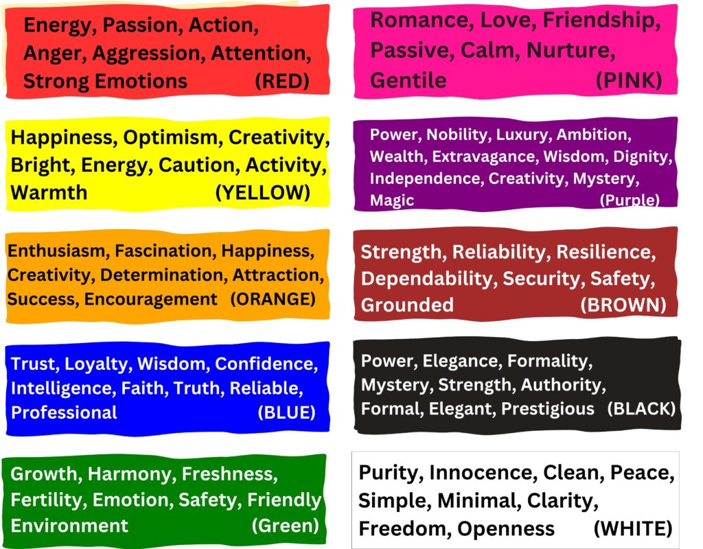
The choice of color for a book’s spine is not merely a matter of aesthetics; it’s a psychological gateway to the content within. Colors have the power to evoke emotions and set expectations. Red, for instance, can stir up excitement or a sense of danger, making it an excellent choice for thrillers or action novels. Pastel hues, with their soft and soothing appeal, are often perfect for romance or lighter reads. The psychology behind these color choices is profound. They create an instant, subconscious connection with potential readers, drawing them to a book that resonates with their current mood or desired reading experience. In children’s books, bright and vibrant colors can attract a younger audience, while more muted tones might appeal to readers looking for serious, contemplative literature. It is summed up very nicely in this Colours and Emotions Chart.
6.1.2 Coherence with Overall Design
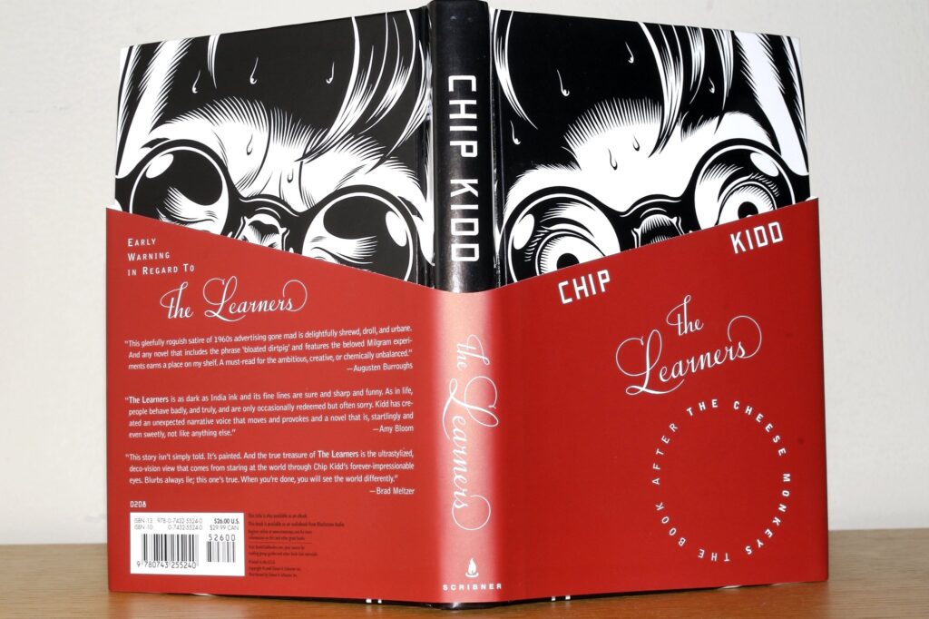
The spine color should be more than just an isolated design element; it needs to be a part of a larger, harmonious whole. It should complement and enhance the front and back cover designs, creating a cohesive visual narrative that encapsulates the book. This unity in design aids in establishing a brand identity for the book or series. A well-coordinated color palette can make the spine stand out when placed amongst a sea of books on a shelf, while still maintaining a sense of belonging to its cover design. This coherence is especially crucial in a series, where the spine colors can form a distinct, recognizable pattern when placed side by side, aiding in brand recognition and series continuity.
(Courtesy: karenhorton (flickr). (CC Licenses 2.0)
6.1.3 Visibility Factor
The visibility of a spine color in different lighting conditions is a critical aspect of bookshelf or book display stand appeal. In the diverse lighting environments of bookstores and libraries – from the bright, fluorescent lights of a retail space to the softer, more ambient lighting of a library – the spine must catch the eye of the passerby. Fluorescent or metallic colors can be particularly effective in this regard, offering a luminescence that draws attention.

The goal is to have a spine that stands out for its clarity and brightness, ensuring that the book doesn’t get lost in the crowded shelves but instead jumps out at the potential reader. This visual appeal can be the deciding factor in transforming a browser into a buyer.
6.2 Arranging the Spine Type
In this section, we delve into the intricate aspects of spine design, focusing on the interplay of typography and topography. The art of arranging text on a book spine involves not only selecting the right font but also understanding the nuances of text size, scaling, and its strategic positioning. We will explore four key areas: the impact of font selection, the crucial balance of size and scaling, the importance of precise text alignment and orientation, and the art of balancing these elements within the spine’s topography. Each aspect contributes significantly to creating a spine that is visually compelling and harmonious, ensuring the book makes a striking impression on the shelf.

6.2.1 Font Selection
In the world of book design, the choice of font on a spine can speak volumes. A well-chosen font captures the essence of the book’s genre and sets the tone before a page is even turned. For instance, a suspense thriller might feature a stark, bold font that hints at the drama within, while a romance novel might lean towards elegant, flowing scripts. But it’s not just about genre; it’s about personality. A playful children’s book might use a whimsical, rounded font, while a serious historical work might opt for something more traditional and staid.
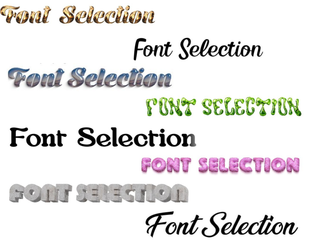
Beyond the mainstream, there’s a realm of custom and unique fonts. These bespoke creations can give a book an edge of originality, making it stand out in a crowded marketplace. The process of designing a custom font can be as intricate and personal as the writing itself, imbuing the book with a unique fingerprint.
6.2.2 Spine Font Size and Scaling
The size of the font on a spine is a balancing act. It must be large enough to be legible from a distance – a critical factor in catching the eye of a potential reader browsing in a bookstore. Yet, it also needs to be proportionate to the spine’s width, especially for thinner volumes. The scale of the font can dramatically alter the book’s presence. Oversized lettering can be striking and bold, commanding attention, while smaller text might convey a sense of subtlety or sophistication.

When scaling the font, consider the visual impact. A slightly larger font for the title can make it pop, while keeping the author’s name and other details in a smaller size can create a well-organized hierarchy of information.
6.2.3 Spine Text Positioning
The alignment and orientation of the text on a spine is crucial in the overall aesthetic of the book. The traditional vertical orientation has a classic appeal and works well for most genres. However, a horizontal orientation can be refreshing and modern, offering a unique visual twist.
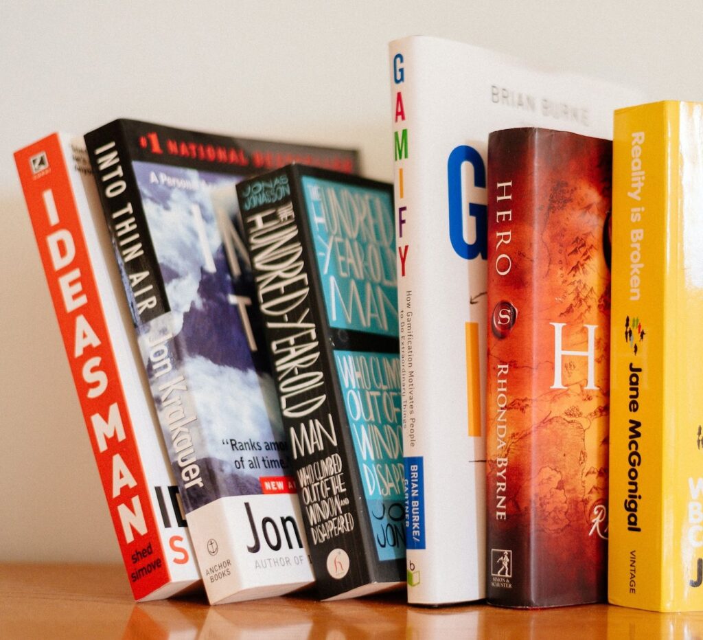
The alignment – whether centered, right-aligned, or left-aligned – should complement the book’s overall design theme. Additionally, the positioning of text creates a visual hierarchy. Typically, the book’s title takes the prime spot at the top, followed by the author’s name, and finally the publisher logo at the bottom. This order helps in guiding the reader’s eye in a natural flow.
6.2.4 Balancing Elements
A well-designed spine is a symphony of balanced elements. The principles of symmetry and asymmetry can be played with to create visual interest. A symmetric design exudes a sense of order and tradition, while asymmetry can lend a dynamic, modern feel.
When incorporating multiple elements on the spine, such as text, logos, or graphic elements, the key is harmony. The text should not be overshadowed by a large logo or an intricate graphic. Each element must have its space, contributing to the spine’s overall narrative without overwhelming it. This balance ensures that the spine is not only visually appealing but also effectively communicates the book’s essence at a glance.
6.3 Designing a Spine for a Book Series
Designing the spine for a book series is a delicate balancing act. It requires a keen eye for detail and a strategic approach to ensure each book’s spine is distinctive while harmoniously fitting into the series as a whole. This task is not just about aesthetic appeal; it’s about storytelling and brand building. The spines of a series are visual narratives that, when placed side by side, should tell a story of their own, reflecting the series’ journey and evolution.

In this section, we delve into the nuances of crafting spine designs that are individually captivating and collectively cohesive. From maintaining a consistent theme across the series to subtly differentiating each book, and ensuring seamless coherence with the book covers, this segment provides a comprehensive guide on how to design spines that make each book in the series a piece of a larger, beautiful puzzle. By mastering these key elements, designers can create a spine series that not only looks impressive on the shelf but also strengthens the series’ identity and enhances the overall reading experience.
6.3.1 Consistent Theme Across the Series
Consistency in spine design is crucial for series recognition. This can be achieved by maintaining a consistent color scheme, typography, and layout across all books. For example, using a similar color palette but varying shades or tones can differentiate each book while keeping the series visually connected. Consistency in font style and size across the series lends a professional and cohesive look. This uniformity makes the series easily recognizable on a shelf, appealing to both existing fans and new readers.
6.3.2 Series Numbering
Clearly displaying the book number on the spine is essential for series where the reading order matters. The numbering should be prominent but not overpowering. Consider creative ways to incorporate numbers, like integrating them into the design or using varying fonts or colors for differentiation. This not only aids in reader navigation but also adds a visual element to the spine design.

6.3.3 Differentiating Each Book
While maintaining a consistent theme, each book in the series should have its own identity. This can be achieved through variations in color, a unique image or symbol on the spine, or subtle changes in the design elements. For instance, a fantasy series might feature different mythical creatures on each spine, symbolizing the core theme of each book. These distinctions make each book appealing on its own while contributing to the series’ overall aesthetic.
6.3.4 Coherence with Front and Back Cover
The spine should not be an afterthought but an integral part of the book’s overall design. It should transition smoothly from the front to the back cover, creating a continuous visual story. This can be achieved by extending elements from the front and back cover onto the spine or by using complementary colors and styles. For example, a landscape scene on the cover can seamlessly wrap around the spine, or a graphic element from the cover can be echoed in the spine design. This coherence enhances the visual appeal of the book both as a standalone piece and as part of a series.
6.4 Creating a Unique and Attractive Spine Design
Designing a book spine that is both unique and attractive is an art. It’s about creating a design that not only catches the eye but also gives a glimpse into the soul of the book. The spine, though small, is a critical aspect of the book’s overall design. A well-designed spine can draw in readers, enticing them to pick up the book and explore its contents. It’s not just about aesthetics, though. The spine also serves a practical purpose, containing important information like the title, author’s name, and publisher logo. Balancing these functional requirements with a desire to create a visually appealing design can be challenging, but with careful planning and creativity, it’s possible to design a spine that is both beautiful and informative. Here are some key aspects to consider:
6.4.1 Visual Appeal
The visual appeal of a book spine can be enhanced through the use of contrasting colors, distinctive logos, and decorative elements. These elements should work together to create a spine that stands out on a bookshelf.
6.4.1.1 Contrasting Colors
In the realm of book design, the spine plays a crucial role as it is often the first aspect visible to potential readers on shelves. To make a lasting impression, designers leverage various elements such as contrasting colors, distinctive logos, decorative features, and unique materials, each contributing uniquely to the spine’s appeal. Starting with contrasting colors, we explore how this element is not merely about aesthetic pleasure but also about effective communication and emotional connection with the reader. Following this, we will delve into the significance of distinctive logos, the artistic touch provided by decorative elements, and the sensory impact of unique materials.
Purpose and Effect: Contrasting colors are essential in creating a visual impact. They help in distinguishing the book on shelves crowded with other titles. The right choice of colors can convey the book’s mood or genre even before the reader sees the cover.
Strategies for Implementation: Consider using complementary colors, which are opposite each other on the color wheel, for a striking effect. For instance, a bright red against a deep blue can create a sense of excitement and drama. Light colors on a dark background or vice versa can draw attention effectively.
Psychology of Colors: Different colors evoke different emotions. Yellow can suggest optimism, red can convey passion or danger, and blue might evoke calmness. Choosing colors that align with the book’s content can create an intuitive understanding of the book’s theme. Click here to access the Colours and Emotions Chart that was presented earlier in this blog post.
6.4.1.2 Distinctive Logos
Moving beyond the impact of contrasting colors, the next critical aspect of spine design is the incorporation of distinctive logos. Therefore, this segment is dedicated to exploring the power of branding through logos and symbols that resonate with the reader and reinforce the identity of the book or author. A well-crafted logo can be a game-changer in the competitive world of publishing, offering instant recognition and a visual anchor for the readers. Following this exploration of logos, we will venture into the realm of decorative elements, which add artistic flair and depth to the spine design, and then discuss the significance and sensory appeal of unique materials used in spine construction.
6.4.1.3 Importance of Branding
Logos serve as a branding tool. A well-designed logo on the spine can increase brand recognition for an author or a series. It’s especially important for authors with multiple works, as it helps in creating a consistent brand image across different books.
6.4.1.4 Design Considerations
The logo should be simple yet memorable, scalable to fit different sizes, and legible. It might be an abstract symbol, a stylized version of the author’s initials, or a graphic that represents a central theme of the book.

A great example of this is the logo used for the Harry Potter series by J.K. Rowling. The logo, which is often found on the spine of the books, features a distinctive typeface with lightning bolt detailing on the ‘P’ of Potter, making it instantly recognizable1. It’s simple, using only text, but it’s incredibly memorable due to its unique design.
It’s scalable, looking great on everything from the book spines to promotional materials and merchandise. The legibility of the logo is also excellent, with clear, bold letters that are easy to read even from a distance.
6.4.1.5 Case Studies
Think of iconic book series where the logo or font style has become synonymous with the series itself, making it recognizable even from a distance. One of the greatest examples of this is of course The Godfather by Mario Puzo: The cover design by S. Neil Fujita, with illustration by John Kashiwabara, is so iconic that you can find numerous T-shirts that copy its design6. The bold, stylized puppeteer’s hand holding the strings against a stark black background is instantly recognizable and has become synonymous with the series.

6.4.1.6 Decorative Elements and Unique Materials
Decorative elements such as patterns, textures, or embossing can add depth and interest to the spine design. These elements can be subtle or bold, depending on the overall design of the book.
Exploring the use of unique materials like cloth, leather, or metallic finishes can add a tactile dimension to the spine, making it not just visually appealing but also pleasant to hold.
6.4.2 Complexity and Simplicity
While intricate designs can be attractive, it’s important to remember that the spine is a narrow space and can become cluttered easily.
Balancing Design Elements: A simple, bold design can often be more effective than a complex one that is hard to decipher. The key is to strike a balance between complexity and simplicity. Too many elements can overwhelm the viewer, while too few may not convey enough about the book.
Legibility: Ensure that the title, author’s name, and any other text on the spine are legible. Even the most beautiful design can fail if the text is not readable.
Consistency: The spine design should be consistent with the front and back cover design. This creates a cohesive look and feel for the book.
Remember, the goal of a good spine design is not just to look good, but to effectively convey the essence of the book and attract the right readers. It’s an integral part of the book’s overall design and should be given careful consideration.

Sources:
- https://www.pen2publishing.com/book-spine/ ↩︎
- https://www.thebookdesigner.com/quick-look-fine-art-book-spine-design/. ↩︎
- https://miblart.com/blog/how-to-design-book-spine/ ↩︎
- Interior Margins for Standard Book Sizes – pagemaster.ca ↩︎
- https://blog.lulu.com/book-spine/ ↩︎
- The 25 Most Iconic Book Covers of All Time (bookriot.com) ↩︎
4 Responses to Book Spine Design Tips: How to Make Your Book Stand Out